Your website is the cornerstone of your digital marketing campaigns. Most of the efforts you are putting into social media, search engines, and email marketing will lead to your website. This is why it’s critical to have a properly designed website that is sure to convert users into leads.
For many customers, your website is the first impression they have of your business. You want your website to not only look great but also show users what you do, and give them easy ways to take action (call, email, purchase, etc.).
1. Mobile-Friendly Web Design
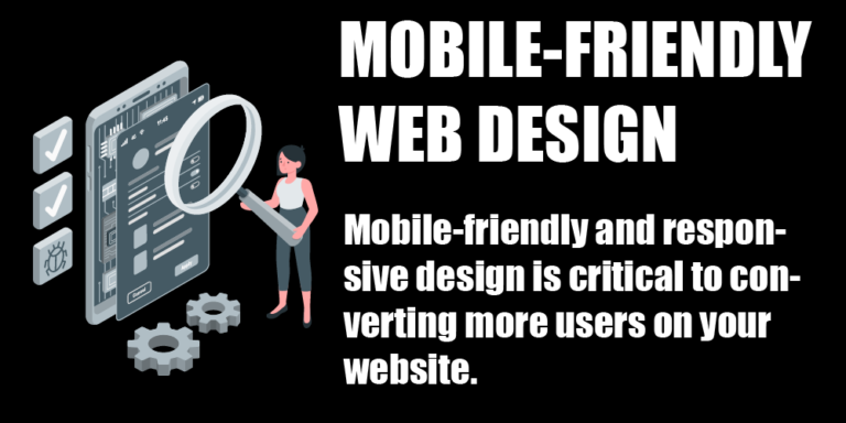
Your website needs to have a mobile version. A large percentage of people using the internet are doing so on their mobile devices. If you are trying to convert leads into paying customers, your website needs to be easy to navigate. Mobile-friendly websites convert more people than websites without a mobile version.
In 2019, Google started indexing websites using a mobile-first method. Meaning, that the mobile version of a website is going to be read and indexed first. If you don’t have a mobile-friendly website, your ranking on SEO is going to suffer.
2. Keep Branding Consistent On Your Website
When designing your website, you want to make sure it matches the branding for the rest of your business. We covered branding on our marketing and design podcast. During this episode, we explained the importance of consistent branding across all of your marketing channels. Use colors from your logo, and keep your font choices consistent.
Matching your brand across all channels (print, web, social, etc.) is crucial to maintaining brand awareness, and increasing your company’s credibility. Cohesive design helps create trust with users, making them more likely to purchase your goods or services.
If you need help with branding, or you just want to spice things up with your business, contact us and we’ll be happy to help!
3. Simple Navigation
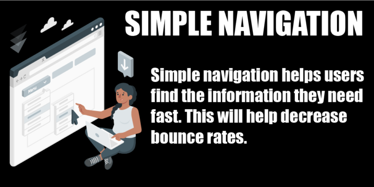
Simple navigation is an incredibly effective way to drive conversions on your website. Having clear navigation will allow visitors to find the information they need right away. Users tend to leave websites when they cannot find the answers they want within a few seconds.
Your main navigation should have clear, specific menu options. If you look at our main navigation and nothing else, you can see that we do Google Search Marketing, Web Design, Social Media Management, and Graphic Design. Within one glance, you understand what our company does.
We suggest putting no more than 7 items in your main navigation bar. If you need more menu options, use dropdowns to organize your pages, but be sure the top option in these dropdowns is clear so users understand the type other information is included in the dropdown.
4. Use Photos and Videos
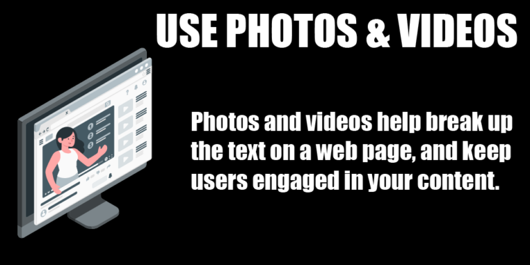
Photos and videos are a great way to keep people engaged with your content. The average attention span of a web user is relatively short. Using photos and videos can snap them back into the game and keep them engaged. If you are selling a product on your website, including photos and videos of your product in as many places as possible.
One of our clients, Underwater Fish Light, sells a very unique (and beautiful!) product. They include photos and videos of their product on every single page to keep people engaged, and pushed them towards purchasing.
If you’re selling services, like us, you can use photos and videos to help explain your services more. On our SEO page, we included a video that explains what SEO is and how it works. This way, if someone doesn’t feel like reading the entire page, they can watch the video and get all the information they need.
If you can, we suggest producing your information on every channel you can: text, photo, and video. This will help you reach users, no matter how they like to digest their media.
5. Strong Calls To Action
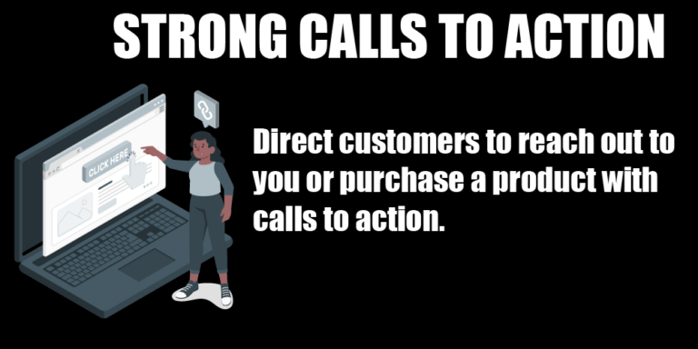
What do you want users to do when they are on your website? Do you want them to purchase a product, fill out a form, or call you? The best way to get customers to take action is to TELL THEM to take action. Buttons are a great way to place calls to action throughout your website. You can use buttons like:
You can also use headlines to create urgency in users that will make them more likely to take action:
Are You Tired Of Being Ashamed Of Your Web Design?
Many people try to figure out why they are not getting phone calls or orders on their website, but they don’t realize they’re not telling users to take any action. By adding simple buttons and headlines, you can greatly increase the conversion rate of your website.
Need Help With Web Design?
Give us your domain and email address, and we’ll get to work!

