
If you’re not an experienced web designer, you’re probably not even sure what responsive web design is. We don’t blame you. It’s not something people about every day. Responsive design makes your website mobile friendly, which makes it much easier for users to navigate your site from their phones and other mobile devices.
WHAT IS RESPONSIVE WEB DESIGN?
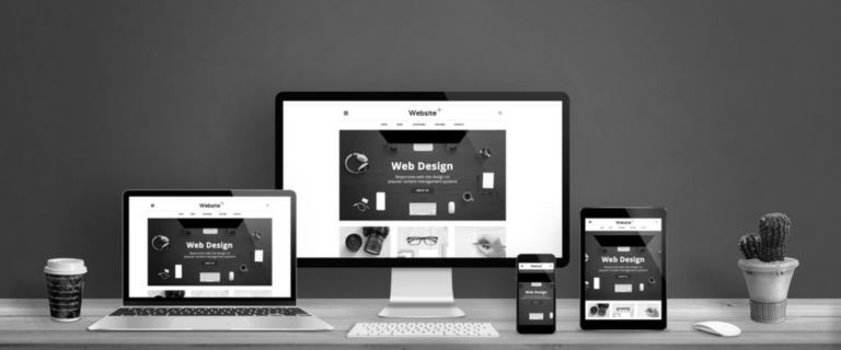
You may not realize it, but you use responsive web design almost ever day. Responsive web design is a web design technique that automatically adjusts the size of the website to adjust to the size of the screen that is being used to view it. If you’re viewing this blog on a computer screen, just change the size of the browser window. It’s okay, we’ll wait………did you do it? If you did, you’ll notice that the size of the menu at the top of the page, as well as the content on the page itself change size and formatting. Congratulations! You just saw responsive design in action.
WHY DO YOU NEED RESPONSIVE WEB DESIGN?
LOOK GREAT AT ANY SIZE
We live in a society that uses a seemingly endless variety of screen sizes. Users could be viewing your website on a large desktop screen, or from their mobile devices. Because of this, you can’t possibly predict the size of the screen user will be using when viewing your site. By using responsive design techniques on your site, you’ll be able to guarantee that your amazing content will be able to be enjoyed on any device.
SEO OPPORTUNITIES
In 2019, Google started mobile-first indexing. This means Google uses the mobile version of the website for indexing and ranking. If your website doesn’t have a mobile friendly version, that last sentence should really scare you. Due to the ever-increasing amount of people surfing the web on their mobile phones, mobile indexing is more important than ever.
If you’re ready to improve your website and make it more effective for users on their phones, check out our Web Design Services!